Owen Perry is an award-winning creative freelancer with nearly 20 years of experience designing and building websites. He offers a full spectrum of creative services, including web design, web development, eCommerce, branding and identity, as well as extensive experience with photography and video.
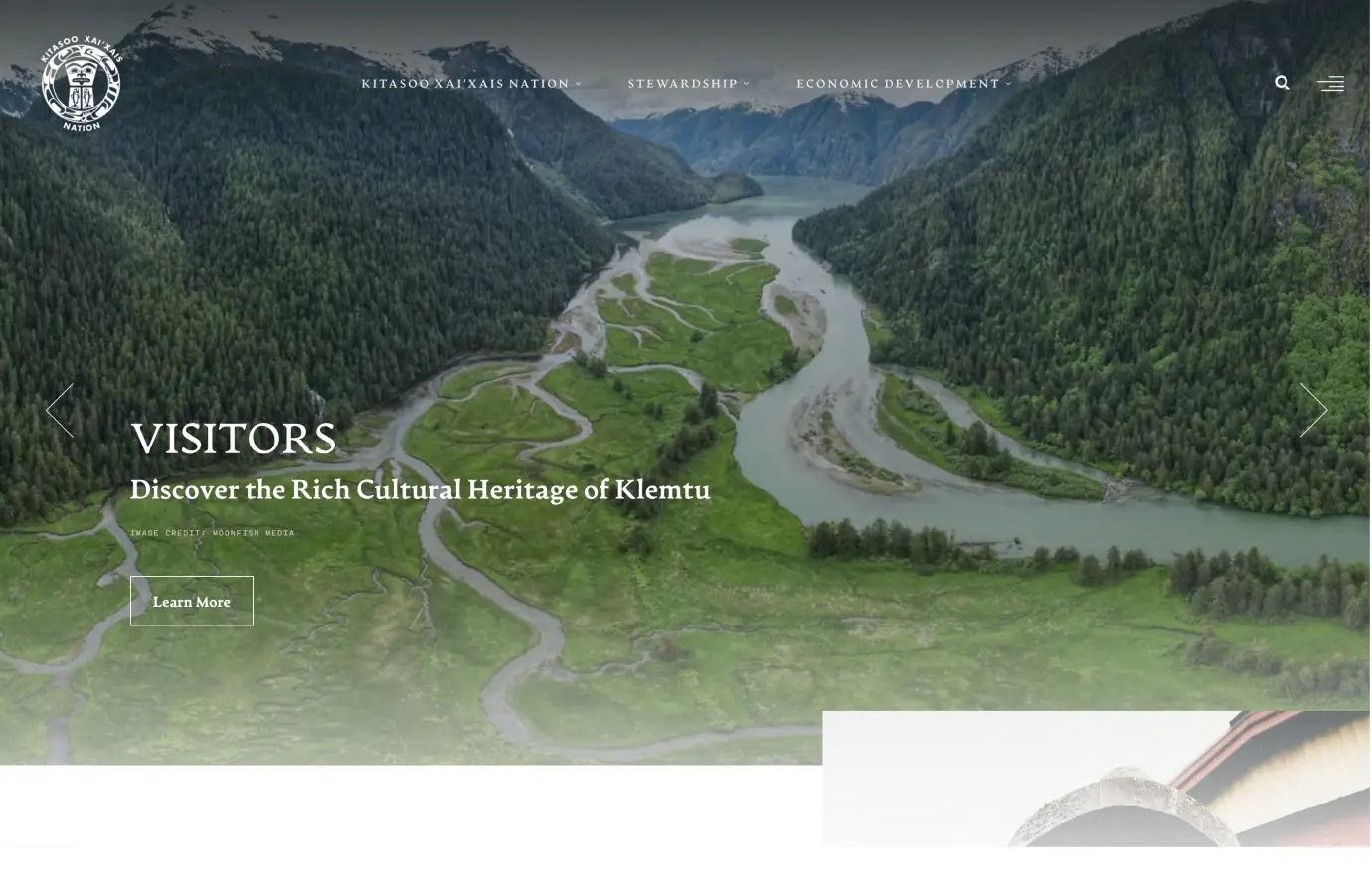
Kitasoo Xai'xais
2023
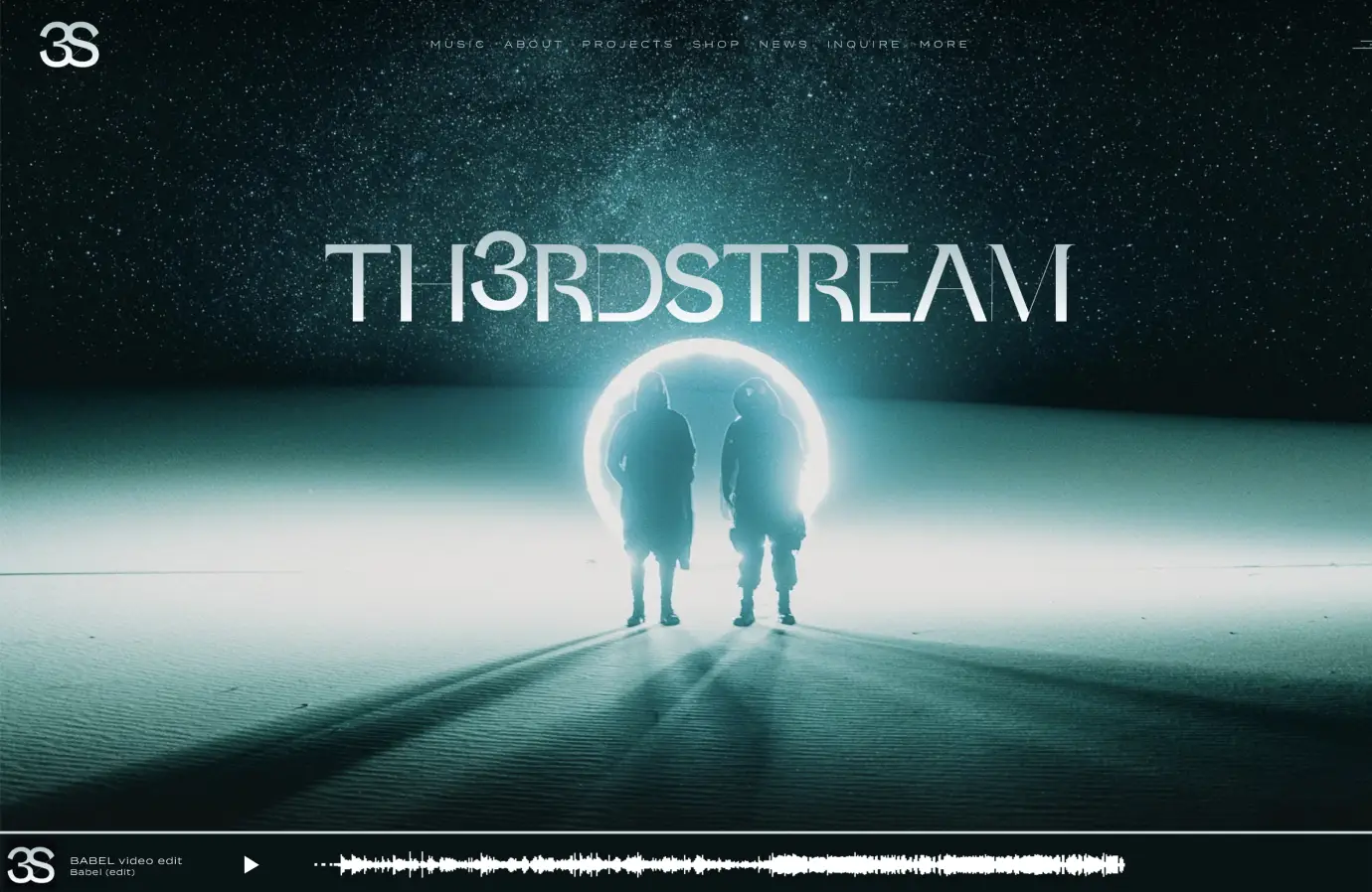
Th3rdstream
2023
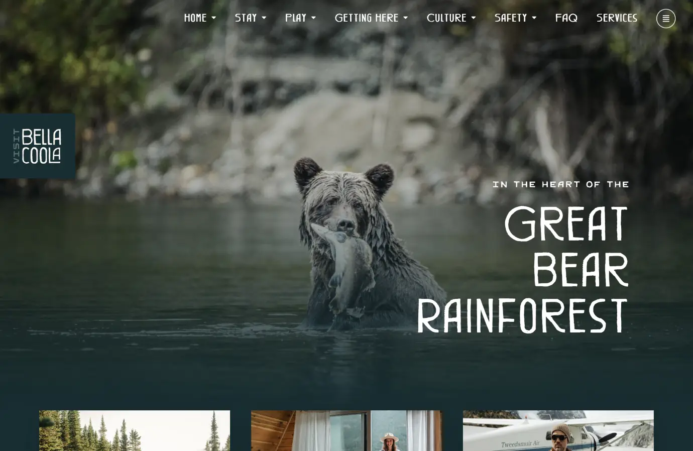
Tourism Bella Coola
2023
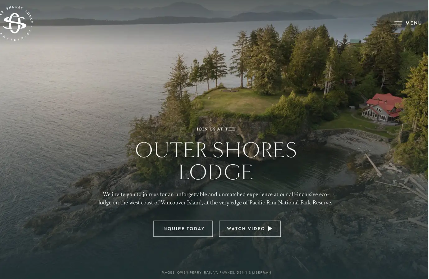
Outer Shores Lodge
2023
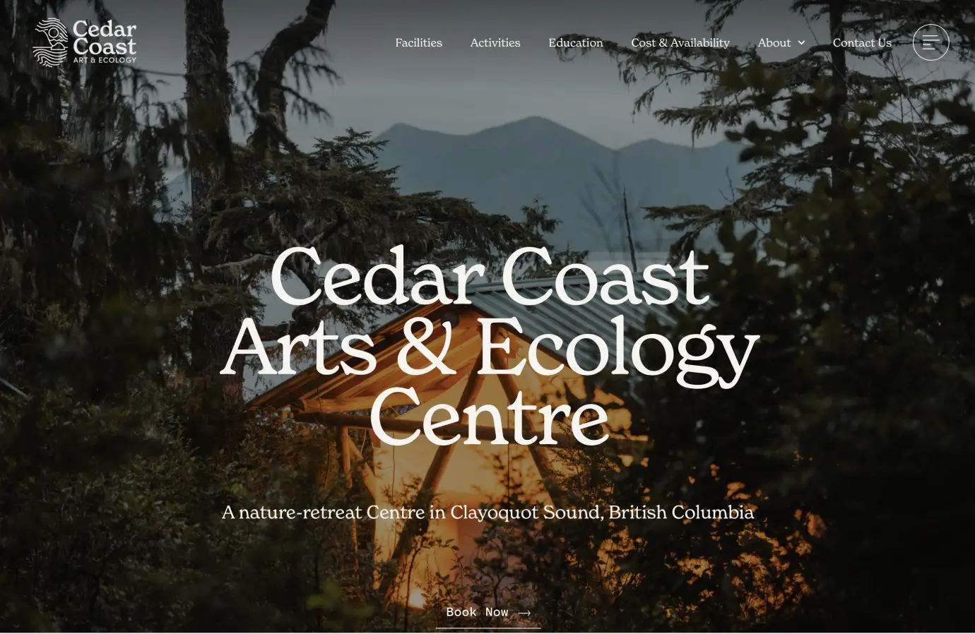
Cedar Coast
2023
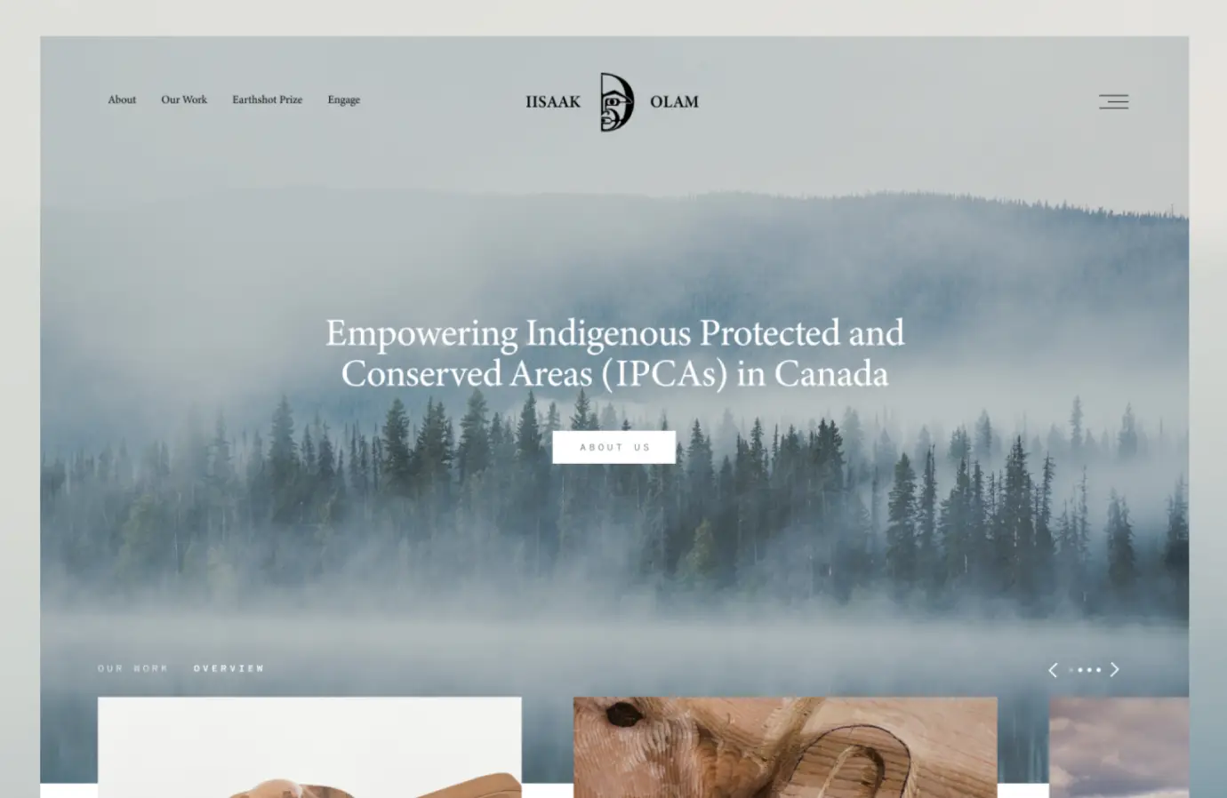
IISAAK Olam
2022
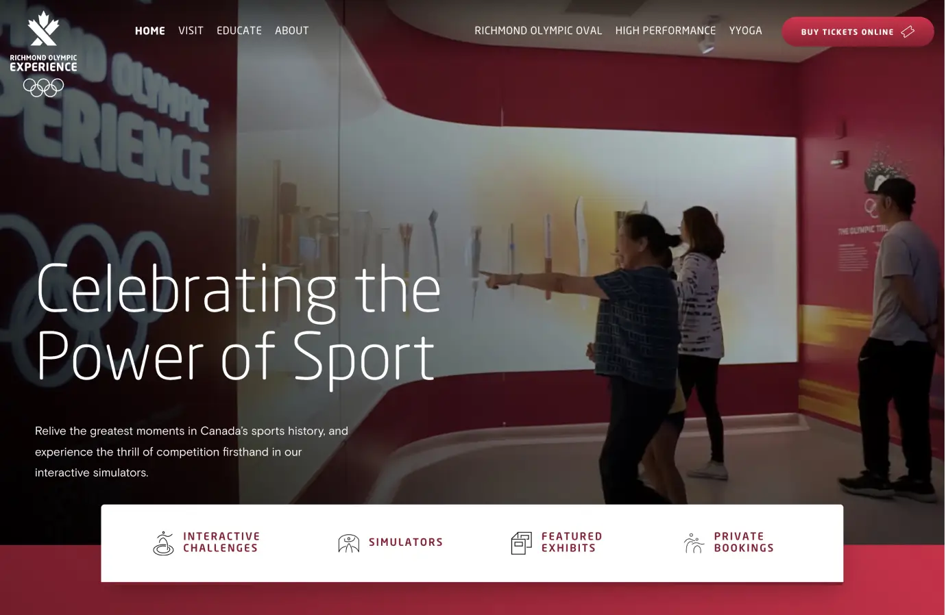
Richmond Olympic Experience
2022
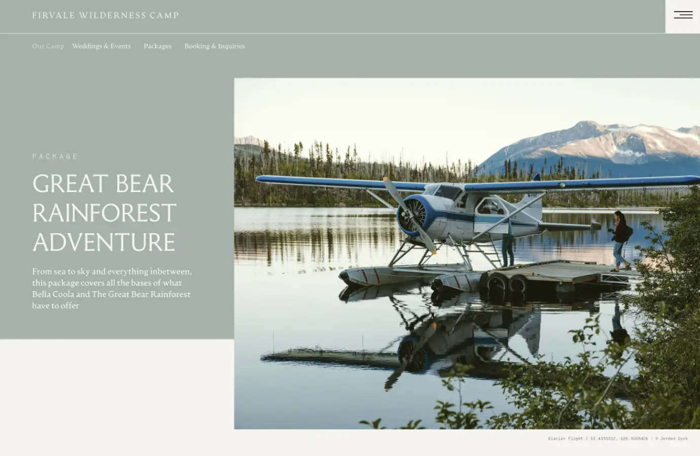
Firvale Wilderness Camp
2022
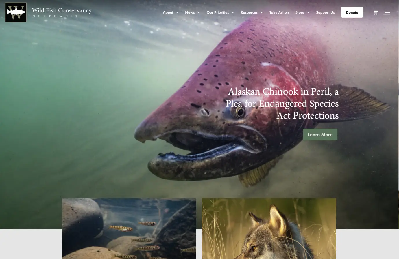
Wild Fish Conservancy
2022
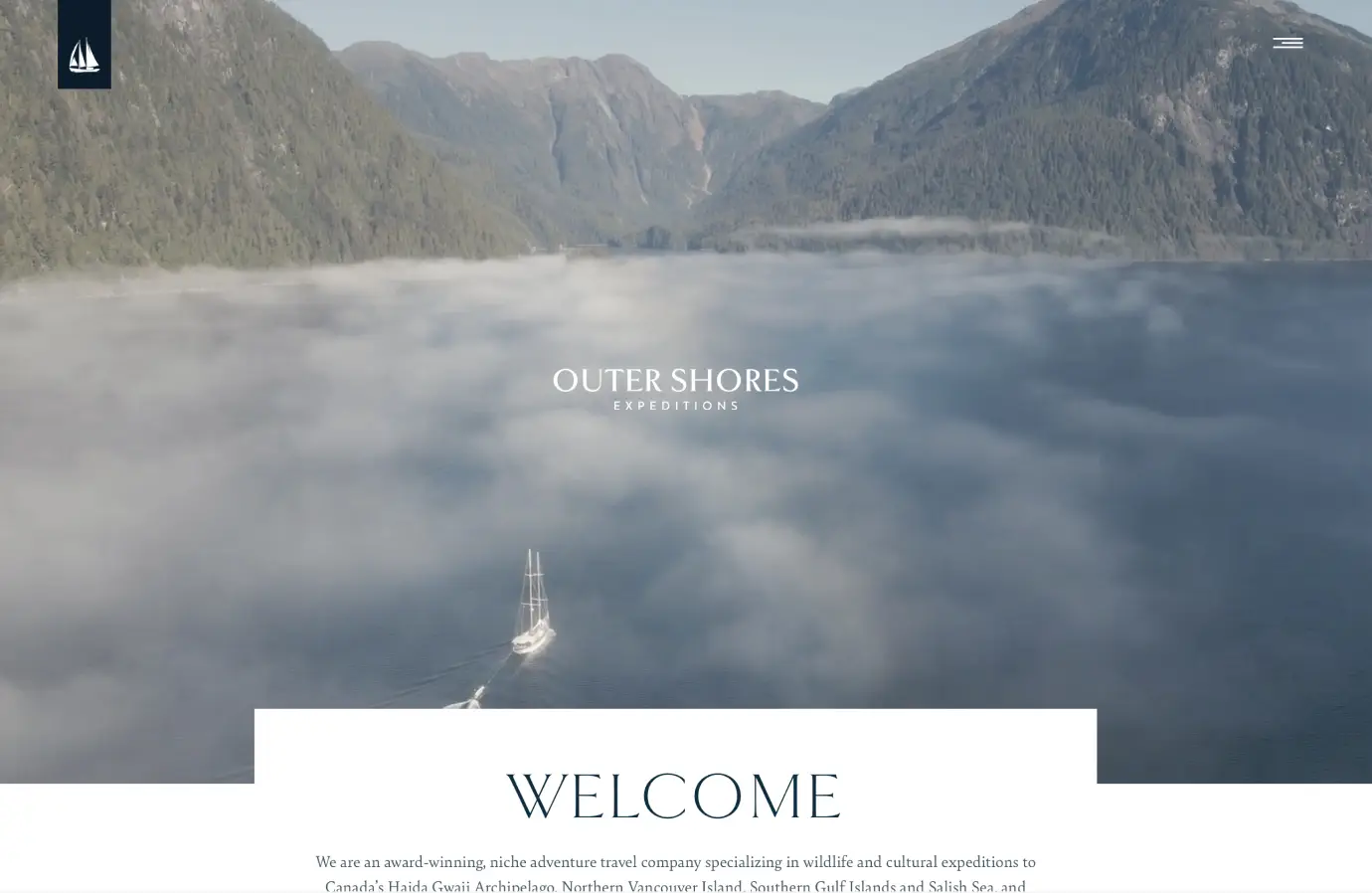
Outer Shores Expeditions
2021
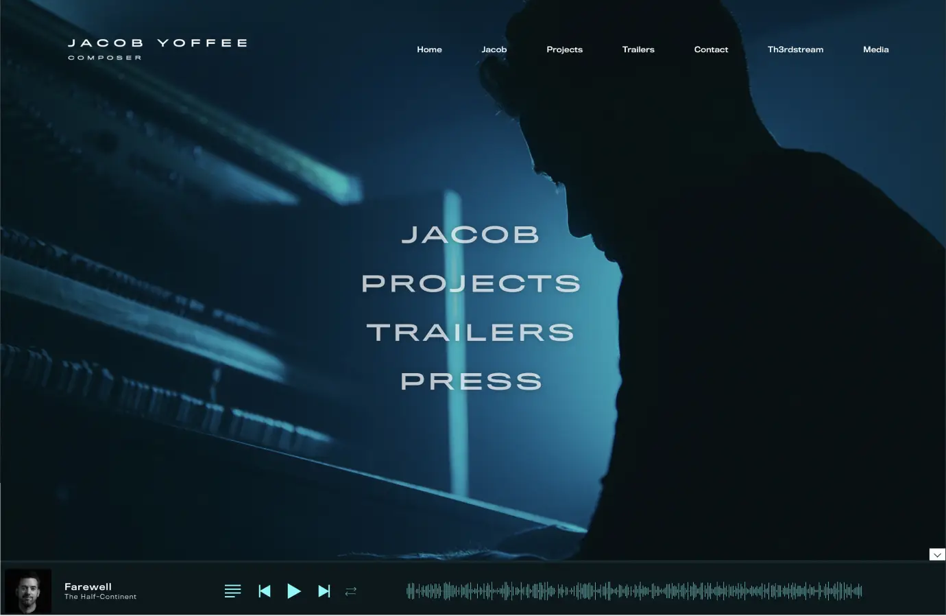
Jacob Yoffee
2020
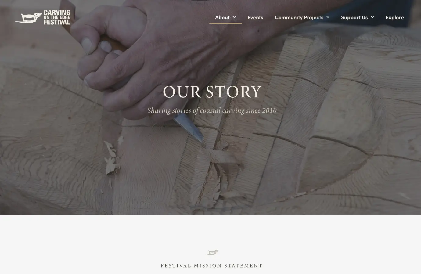
Carving Edge Festival
2020
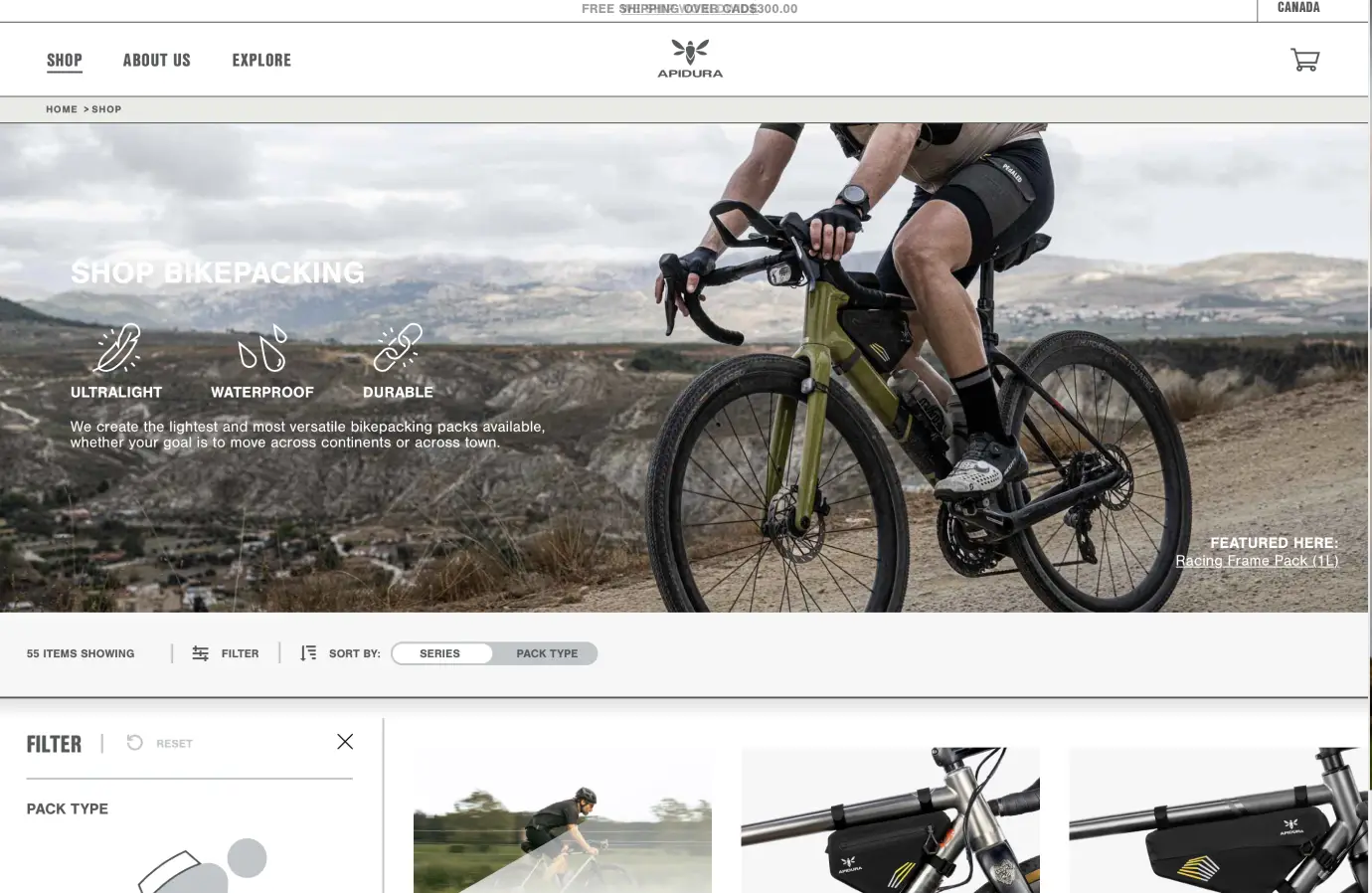
Apidura
2018
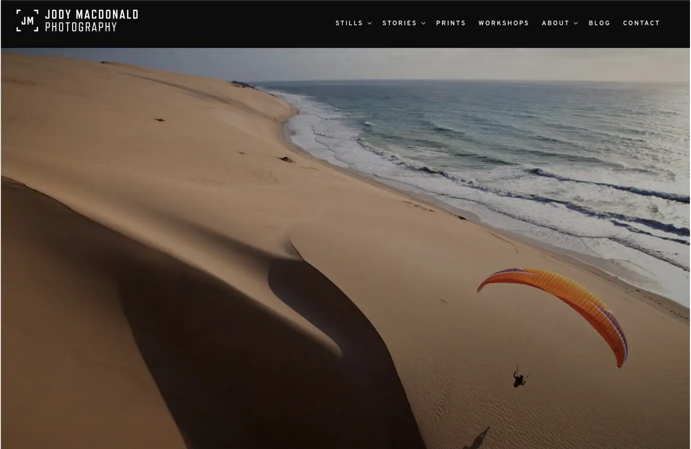
Jody
2018
Drop Owen a Message
Looking to collaborate? Reach out using the contact form below.